
Design report
30 Aug 2026
Training & Placement Office
Internship No Objection
Certificate portal
Nine screens, built as three working versions each, so the office can decide by using them rather than by imagining them. This report sets out what was built, the decisions behind it, and the questions only the University can answer.
9
screens
27
working versions
0
real student records used
Prepared for the Training & Placement Office, SGT University, Budhera, Gurugram–Badli Road, Gurugram 122505, Haryana. Course data is the University’s own; every student identity in these prototypes is fabricated.
What the present process costs
These figures are counted from the office’s own 2027 workbook. They are not an argument against the people running the process — they are what happens to any process of this size kept in a spreadsheet.
36%
of NOC requests are rejected
Fifty-nine of the hundred and sixty-five completed requests on the UA-1 track. The two reasons named are incomplete syllabus mapping and incorrect company details — precisely the two things this portal automates.
79%
of requests are duplicated across sheets
A hundred and eighty-one of two hundred and twenty-seven registration numbers appear on two or more sheets, several on four. Approved and Rejected are separate tabs that must be kept in step by hand.
12
hand-typed spellings of six states
Including “Verific” — a truncated typo — and both “Incomplete syllabus mapping” and “No syllabus mapping” for the same situation. Every one of them was typed into a cell.
116
rows share one bundled rejection reason
“Rejected due to incomplete syllabus mapping / incorrect company details” welds two unrelated failures into a single string, so the office cannot answer which of the two actually dominates.
0
date columns anywhere in the records
No submitted-on, no decided-on, no approver, no reason field — and no column recording the syllabus percentage that the whole process exists to establish.
195/203
offer letters are Google Drive links
Four more are photographs. Access control is whatever the link sharing happens to be set to, and the files sit outside any university system.
The single number worth remembering
Roughly one in three requests is refused, and the two reasons named are incomplete syllabus mapping and incorrect company details. Both are preventable — one by validating the company’s details at the moment of submission, the other by chasing six teachers automatically instead of by hand. That is the case for building this.
Decisions taken, and what was rejected
Each of these is a call that shapes the build. Where a decision closed off an obvious alternative, the alternative is named — a decision without its discarded option is not a decision, it is a preference.
- D1
Sign-in uses the University’s own directories, not the ERP
Students and staff sign in with the Microsoft or Google account the University already issues them. The portal never asks for, sees, or stores a password.
Why. erp.sgtu.in is MasterSoft IITMS — ASP.NET WebForms behind an image CAPTCHA, with no API and no single sign-on endpoint. The only way to reuse those credentials would be to hold every student’s ERP password in a form that can be replayed, which is a liability no benefit justifies.
Rejected: asking students for their ERP password and signing in on their behalf.
- D2
One record per request; Approved and Rejected are views, not sheets
Each NOC request is a single row with a status. “Approved” and “Rejected” are questions asked of that row.
Why. Seventy-nine per cent of the current records exist in two or more places because those are separate tabs. Every duplicate is a chance for two copies to disagree, and the office has no way to tell which is right.
Rejected: mirroring the workbook’s tab structure into tables.
- D3
The syllabus percentage is computed, never typed
A subject teacher rules on each course outcome — covered, partial, not covered — and the percentage falls out of those rulings, weighted by contact hours.
Why. A free-text percentage is unauditable and inconsistent between teachers. Ruling per outcome produces the same number by the same method every time, and it is defensible to an accreditation review because the working is preserved.
Rejected: a dial the teacher sets by feel. Tested as a prototype; it anchored the teacher to a number before they had read a single outcome, and the evidence then argued toward it rather than producing it.
- D4
Company verification and syllabus mapping run in parallel
Both start as soon as the TPO clears initial screening. Neither waits for the other.
Why. The current process runs them in series, which is why a request can sit for weeks before a subject teacher ever sees it. Nothing about a syllabus mapping depends on the company having replied.
Rejected: the strictly sequential chain in the original flowchart.
- D5
“No HR mail” is a blocked state, not a rejection
When a company does not reply, the request is marked blocked, with an owner and a clock, and the student can supply another contact.
Why. The present records reject students because a third party did not answer an email. That is not the student’s fault and it is not a decision about their internship.
Rejected: recording non-response as a refusal.
Decisions taken, and what was rejected
continued- D6
Rejection reasons are structured and may be more than one
A decision carries a list of reason codes rather than a sentence.
Why. A hundred and sixteen records share one string bundling two different failures. Structured reasons let the office finally answer which cause dominates, and therefore what to fix.
Rejected: a free-text reason field.
- D7
Offer letters may be photographs, and are access-controlled
PDF, JPEG, PNG and HEIC are all accepted, with a legibility check rather than a format refusal. Files are served only to people entitled to see them.
Why. Nearly every offer letter in the current records is a Drive link or a phone photograph. A PDF-only rule would reject the majority of genuine submissions.
Rejected: PDF-only upload; Drive links as the store of record.
- D8
Every state change is recorded with who and when
An append-only history sits behind each request: actor, time, previous state, new state, reason.
Why. The present records contain no dates and no approver at all. For a document the University signs and a student carries to an employer, the trail is not an extra — it is the thing that makes the document mean anything.
Rejected: storing only the current status.
- D9
The entitlement policy is versioned, and each request pins its version
The thresholds that turn a percentage into attendance relief are editable data with effective dates, and a request records which version it was decided under.
Why. A certificate issued in 2026 must still be explainable in 2029, after the policy has changed twice. Hard-coded thresholds make that impossible.
Rejected: thresholds written into the code.
- D10
No scores, streaks or throughput counters for staff
Faculty, TPO officers and Deans see no leaderboards, targets or processing counts.
Why. Any counter shown to a staff member will eventually be optimised, and the way to optimise an approval queue is to approve without reading. The design language here is borrowed from a consumer learning app; this is the part of it that must not be.
Rejected: gamifying the approval queue.
The screens
Each screen exists in three genuinely different versions. They are not colour variations — they take different positions on how the job should be done, and the point of the review is to choose between them. Every screen is shown at the size its primary audience actually holds.
- 01Sign in and role detectionGet a person into the portal using the account the University already gave them, and work out which of its five audiences they are.Everyone
- 02Request a No Objection CertificateCollect the offer letter and the details the office needs to verify it, without losing the student halfway.Student
- 03Track my requestAnswer two questions and no others: where is it, and is anything needed from me.Student
- 04Map the syllabusEstablish what share of a course an internship genuinely covers, in a way that survives an accreditation review.Subject teacher
- 05The work queueShow what is stuck, and make the next action obvious. This is a throughput screen, and its measure is how fast a backlog clears.TPO officer
- 06Verify the companyEstablish that the internship is real, and record how that was established.TPO officer
- 07ApprovalPresent one request as a complete, trustworthy summary, and take a decision that goes on the record with a name against it.Dean
- 08The certificateThe document the whole portal exists to produce.Everyone
- 09Public verificationLet a stranger holding a printed certificate confirm it is genuine, with no account and no app.Outside verifier
Sign in and role detection
Everyone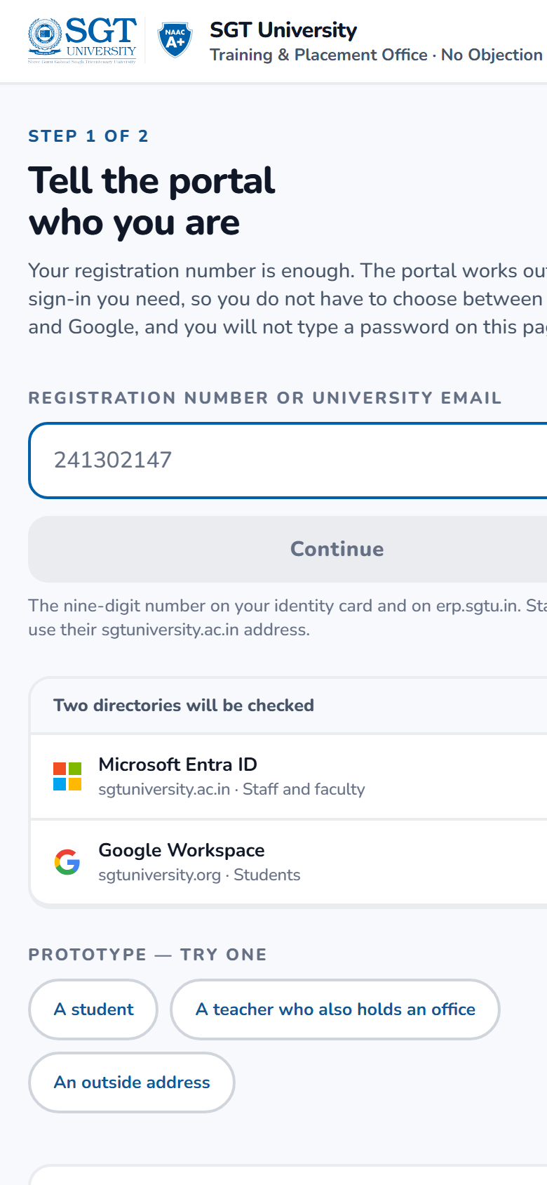
Get a person into the portal using the account the University already gave them, and work out which of its five audiences they are.
There is no password field. The portal hands off to Microsoft or Google and shows the provider’s real address before it does, so the habit a phishing page relies on — not checking where you are typing — is trained against rather than exploited. One person can hold more than one role: a subject teacher who is also a Dean changes hats without signing out. The failure state states plainly that nothing was typed wrong, names both directories that were checked, and points at a named office.
The three versions
- GateIdentity and reassurance take half the screen permanently. Most trustworthy, most steps.
- DeskRegistration number first; the portal works out the provider. Fewest wrong buttons.
- RosterNothing navigates; sign-in expands in place and the role switcher is always present.
What we need decided
Which of the three. Also whether the Google button or the Microsoft button should be the prominent one — currently Google, on the grounds that students are most of the traffic, which makes a Dean’s button the quiet one.
Request a No Objection Certificate
Student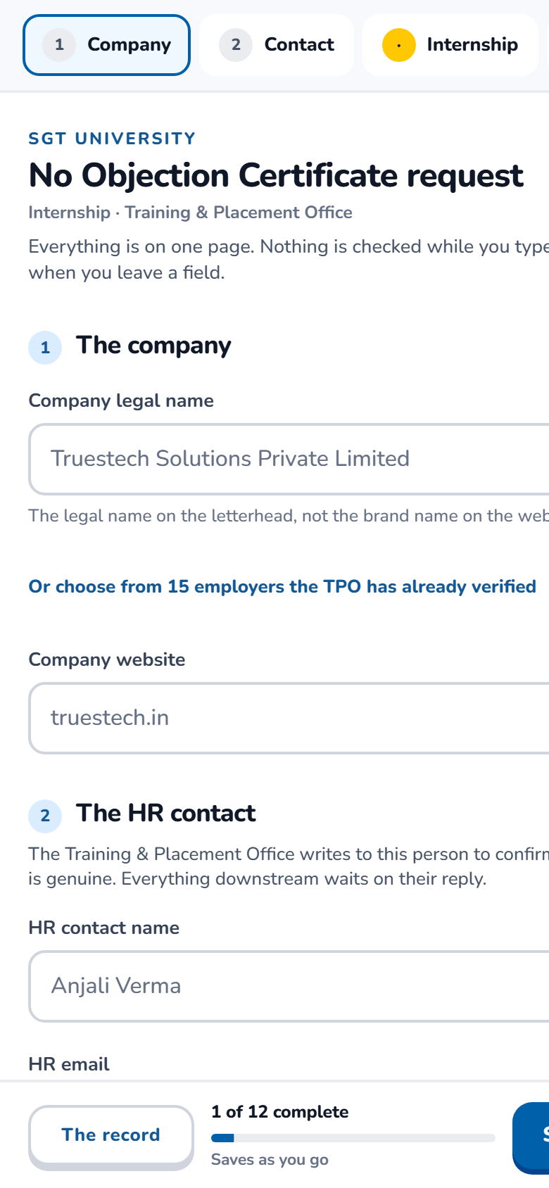
Collect the offer letter and the details the office needs to verify it, without losing the student halfway.
The form asks for the company’s legal name, the HR email the office will write to, the role, dates, mode and stipend, and the letter itself. Validation waits for the field to be left rather than firing on every keystroke. A free webmail address in the HR field raises an advisory note — plenty of genuine small companies use one — but never blocks submission. Drafts are kept, because the connection this is filled on will drop.
The three versions
- LongformOne page, everything visible, section navigation down the side.
- WizardStepped, one decision at a time, with a visible finish line.
- PaperFirstUpload the letter first and confirm what was read out of it.
What we need decided
Which shape suits a first-year on a phone. Also: which fields are genuinely mandatory, and whether the office wants the stipend at all.
Track my request
Student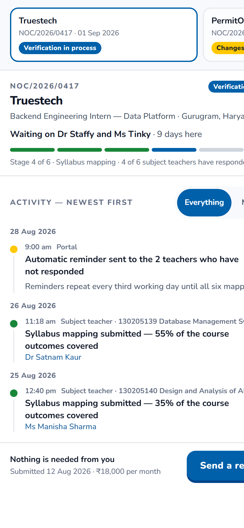
Answer two questions and no others: where is it, and is anything needed from me.
The subject-mapping stage is a fan-out to six teachers who respond independently, so progress is shown honestly as “three of six responded” rather than as a single bar. Blocked states say what is blocking and how long it has been. The avatar’s expression carries the state as well as the status pill does, so it is never colour alone.
The three versions
- StepperA vertical pipeline with the current stage enlarged.
- LedgerAn activity feed — every event, most recent first.
- PulseA single status card with a progress ring and one action.
What we need decided
The genuinely difficult question: whether a student should see WHICH teacher a request is waiting on. Naming them is more useful and invites students to chase a colleague; showing only the role is safer and less useful. The three variants take different positions.
Map the syllabus
Subject teacher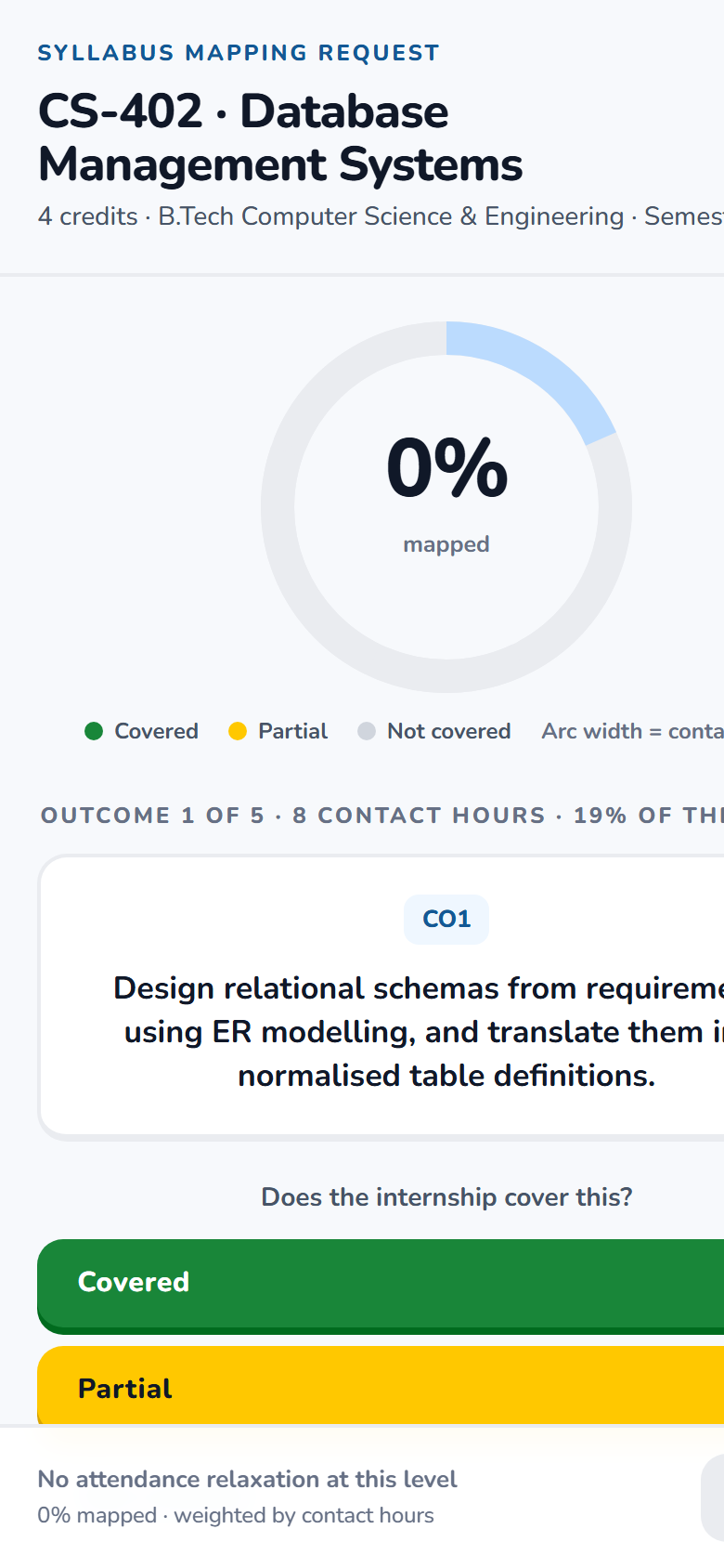
Establish what share of a course an internship genuinely covers, in a way that survives an accreditation review.
The teacher rules on one course outcome at a time — covered, partially covered, not covered — against the real course outcomes from the Semester V syllabus. The percentage is computed from those rulings, weighted by contact hours, and never typed. The ring is divided into one arc per outcome, sized by its hours, so the picture and the number cannot disagree. A partial ruling fills half its arc, which is the same half-weight the arithmetic uses.
The three versions
- FocusOne outcome at a time; the ring carries everything else. Chosen.
- ListAll outcomes at once with the ring as a companion.
- StackCurrent outcome large, ruled ones collapsing beneath it.
What we need decided
The hours-per-outcome split. The syllabus publishes three lecture hours a week — forty-two across the semester — but not how they divide between the four course outcomes. The distribution used here is an assumption and needs the department’s confirmation before any certificate rests on it.
The work queue
TPO officer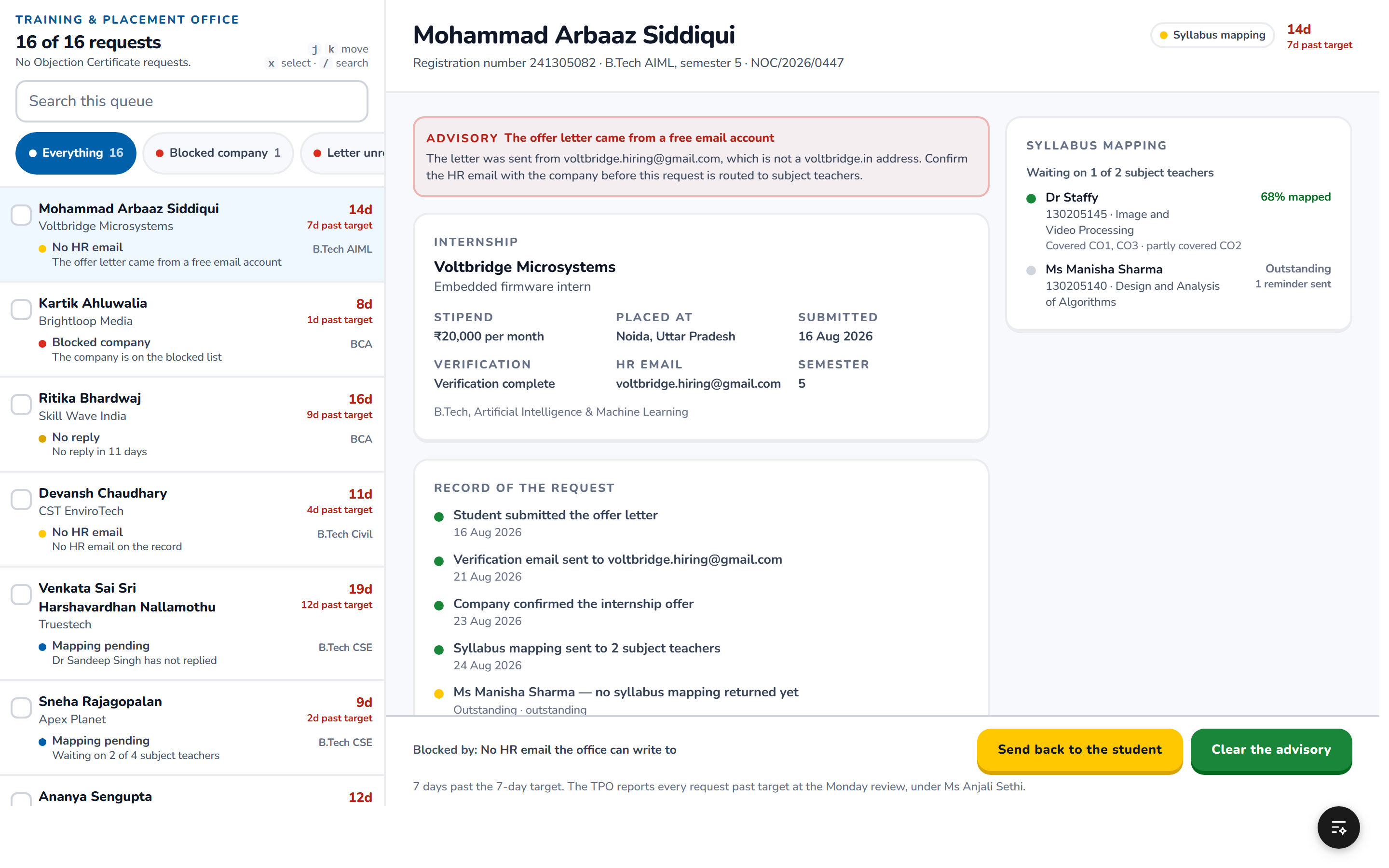
Show what is stuck, and make the next action obvious. This is a throughput screen, and its measure is how fast a backlog clears.
Sorted by what is most stuck rather than by what is newest, because the oldest problem is almost always the one costing a student an internship. Requests waiting on a company, and requests waiting on a teacher, are separated — they need different actions from different people. Reminders can be sent in bulk; approvals cannot. Deliberately the only screen in the product with no entrance animation: animation increases dwell time, which helps a student notice one thing and costs an officer clearing forty.
The three versions
- LedgerA dense table. Most rows visible at once.
- SplitList on the left, the selected request on the right.
- BlockersGrouped by what is blocking rather than by request.
What we need decided
How many requests an officer really handles in a sitting, and what the office’s own service target is in days. Both change the sort order and the alerting.
Verify the company
TPO officer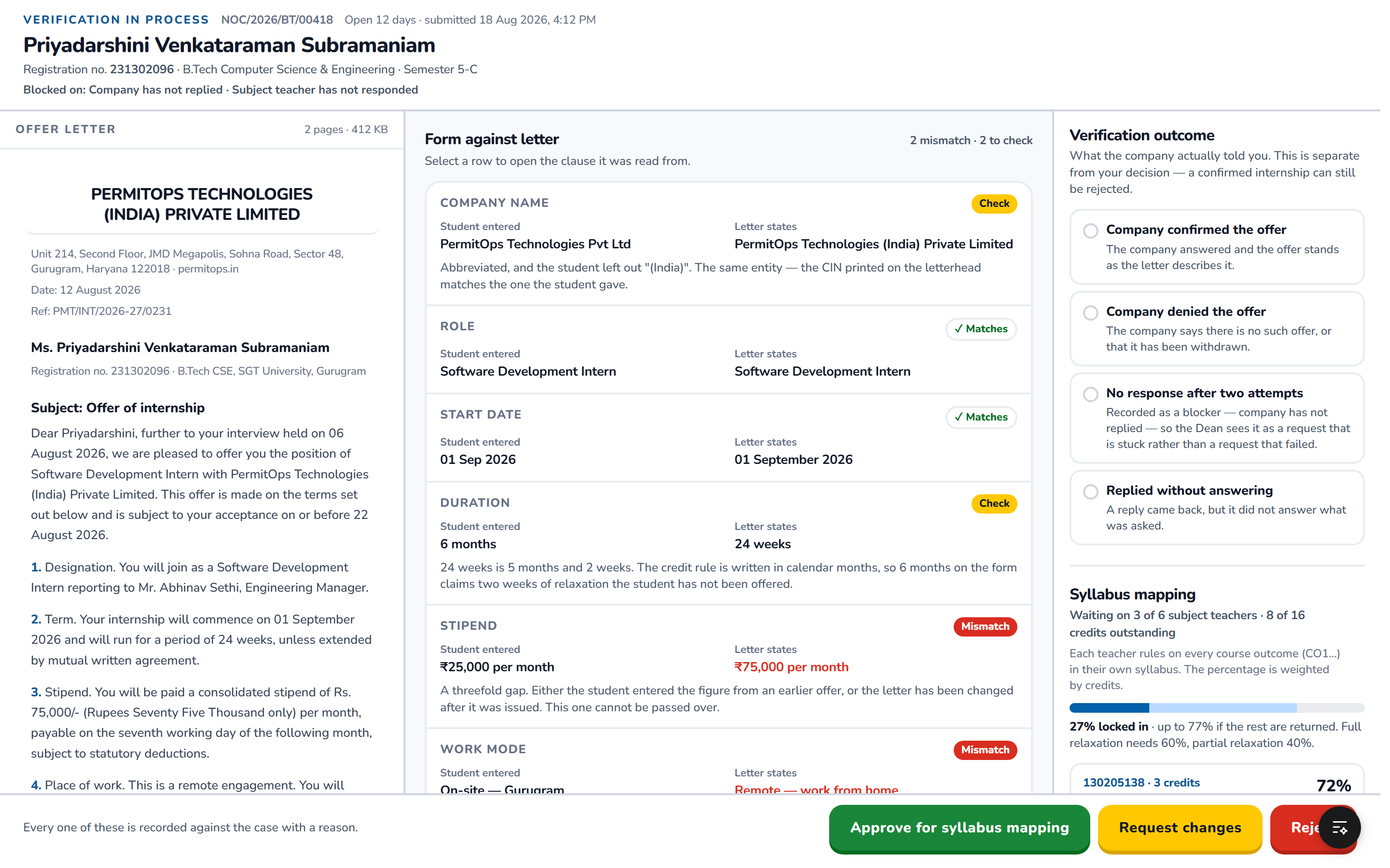
Establish that the internship is real, and record how that was established.
The offer letter sits beside the details the student typed so the two can be compared, with mismatches flagged. The verification email to the company, and whatever comes back, are kept as part of the record rather than in someone’s inbox. Fraud signals — free webmail on a corporate offer, a recently registered domain, a training-fee clause, an implausible stipend — are shown as advisory flags for a person to weigh, never as an automatic refusal, and each can be dismissed with a reason.
The three versions
- BenchDocument and details side by side, evidence below.
- GauntletA checklist of checks, each cleared in turn.
- LedgerOne chronological record of everything done.
What we need decided
How the company’s reply actually gets into the system. Today it arrives in an officer’s mailbox, and nothing in the original flowchart accounts for capturing it. This is the largest remaining gap in the design.
Approval
Dean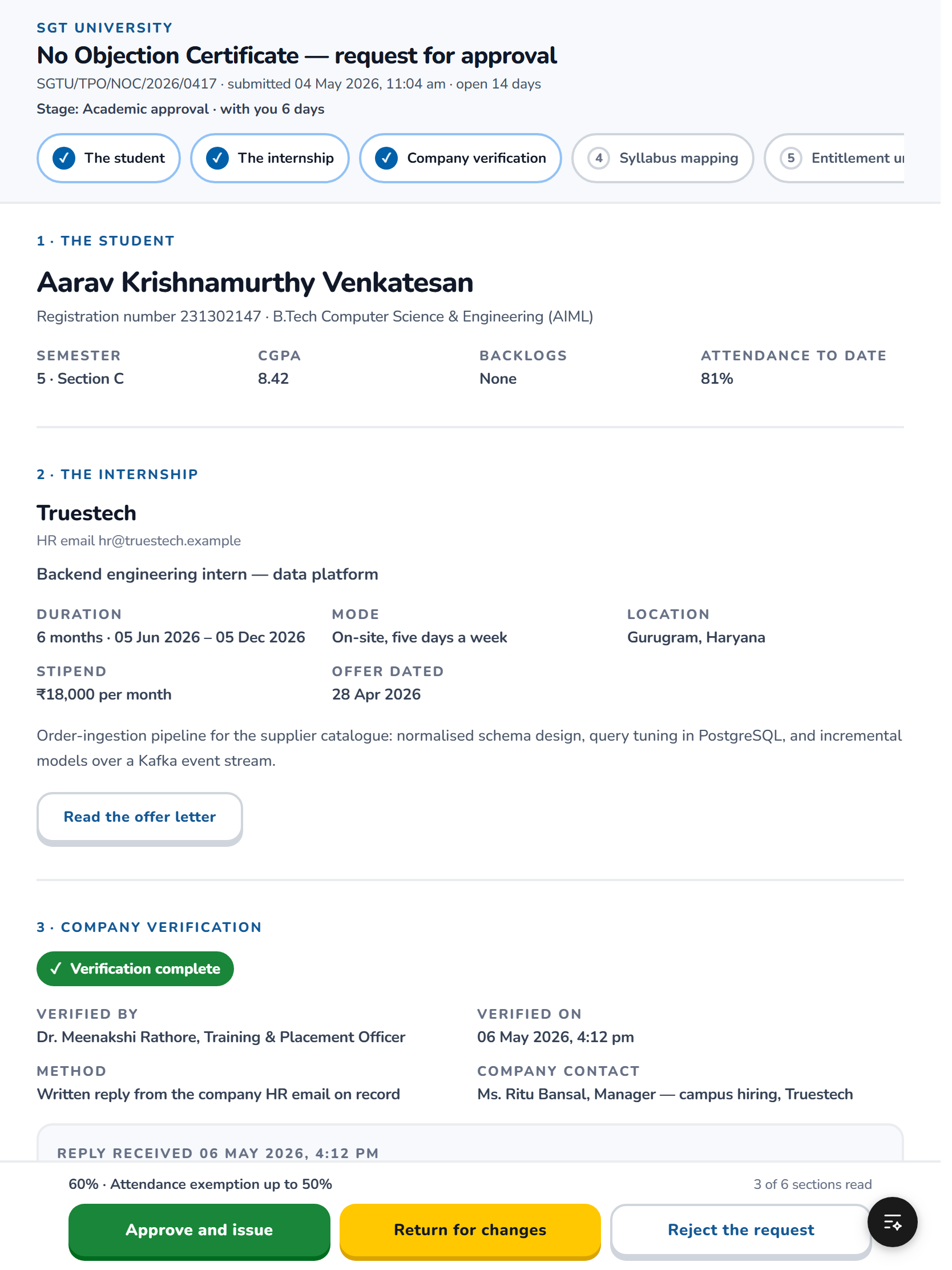
Present one request as a complete, trustworthy summary, and take a decision that goes on the record with a name against it.
Everything needed for the decision on one screen: who the student is, what was verified and by whom, the mapping outcome with its per-subject breakdown, what the percentage entitles the student to, and the chain of approvals so far with names and times. Approving is consequential, so it is deliberate — but a Dean with thirty to sign will not tolerate thirty ceremonies, and a portal that demands them will get thirty rubber stamps.
The three versions
- DossierOne request as a complete file, decided at the end.
- AttestA formal instrument with a signing act.
- SittingA whole sitting of thirty: decisions are provisional and cheap, one signature commits them all.
What we need decided
Whether approval is one Dean or two authorities. The office’s own records show two parallel tracks, UA-1 and UA-2, which the original flowchart does not mention. Also whether a wet signature is still required, and who may hold the signature image.
The certificate
Everyone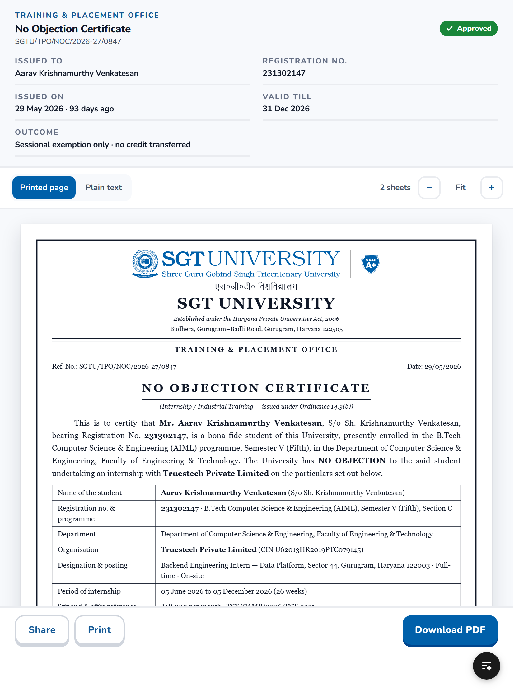
The document the whole portal exists to produce.
A4, print-correct, carrying the University letterhead, the student’s identity, the company and role, the internship period, the mapping outcome and what it entitles the student to, the approval chain with designations and dates, a reference number, and a QR code that resolves to a public verification page. The reference number is designed to be readable aloud over a telephone, because it will be.
The three versions
- GazetteTraditional formal Indian university certificate.
- DossierA modern clean layout.
- PortalLeans into the portal’s own design language.
What we need decided
This is the one where institutional convention outranks design preference. The operative wording, the conditions the certificate asserts on the University’s behalf, and the liability clause all need approval from whoever owns official correspondence — not from us.
Public verification
Outside verifier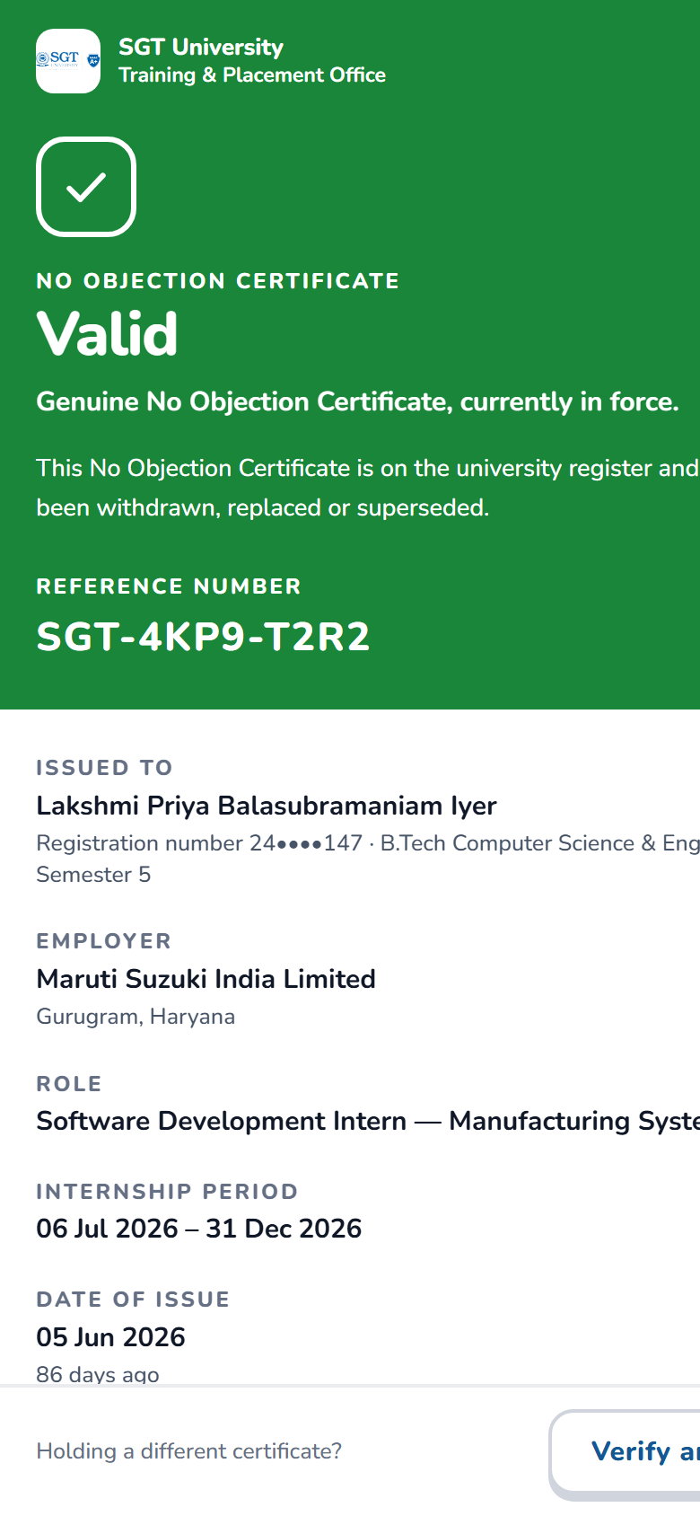
Let a stranger holding a printed certificate confirm it is genuine, with no account and no app.
Shows that the certificate is real, its reference number, the student, the programme, the company, the issue date, the approving authority, and — the reason the page exists — whether it is still valid or has been revoked. It shows nothing else: no stipend, no contact details, no offer letter, no mapping detail. A page that can only ever say “valid” would be worthless; the revoked state is a first-class part of the design.
The three versions
- SealOne large verdict, institutional and calm.
- CounterA service-counter layout with the record beneath.
- LedgerThe certificate’s history as a public record.
What we need decided
How much a stranger should see. Naming the student and the employer is what makes verification useful and is also the most that should ever appear. Confirm the University is comfortable with exactly that list.
What we need from the University
These are the questions the design cannot answer for itself. They are ordered by how badly the answer changes the work, and the first group genuinely blocks it.
Blocking
- Data residency. The portal would run on Convex, Vercel and an authentication provider, all hosted outside India. If University policy requires student records to stay in the country, the entire technical foundation changes — and it gets more expensive to change every week. This is the first question to answer.
- Will IT grant an application registration in the University’s Microsoft and Google directories? Without it there is no sign-in, and everything else is moot.
- Can the office obtain, from the ERP, the list of which teachers teach which subjects to which students? Everything about the mapping step depends on it. If it cannot be obtained, the design changes and should be descoped rather than faked.
Needed before build
- The attendance policy in writing. What percentage earns what relief, decided by whom, and is it uniform across departments?
- Approval authority. One Dean, or the two tracks the records show? Is the Industrial Training coordinator the right academic authority, given that is the course an internship is credited against?
- The hours-per-course-outcome split for each subject, or agreement that outcomes are weighted equally.
- Where does the attendance relief actually get applied? At present the mapping produces an entitlement and stops. If nothing carries it into the system that records attendance, the student still walks a paper chit to the office and the portal has automated an approval but not the outcome.
Needed before launch
- Verified contact details for the help desks named on the sign-in screen. Those currently shown are plausible placeholders and are marked as such in the build — a student whose sign-in has just failed will dial the number on that screen.
- The University crest at print resolution, and the operative wording of the certificate.
- Whether the portal should be bilingual. Partial Hindi is worse than none.
- Who owns the accounts, the domain and the recurring cost after handover.
How to give us your view
Reading about a screen is not the same as using one. The review studio opens all twenty-seven versions in a browser — no account, no installation. Pick the ones you prefer, look at each on a phone, a tablet and a desktop, and leave comments on the exact screen, or on the exact element, you are talking about.
- 1Open the review studio and put your name in the box.
- 2Add the screens you want to argue for, and choose which version each shows.
- 3Comment as you go — on a whole screen from the side panel, or on one element using the feedback button inside the screen itself.
- 4Press Export and send us the .prototype file it saves.
Open the studio
tpo-sgtu.agents.org.in/prototypes/studioEverything else is at tpo-sgtu.agents.org.in/prototypes

Scan to open the review studio on your phone
Send the .prototype file to
The file carries your comments and the walkthrough you built, and can be opened again in the studio by anyone you send it to. Written notes are just as welcome — the file is a convenience, not a requirement.

Nothing in these prototypes is connected to a database. Course codes, course outcomes, the teaching allocation and the recruiter list are the University’s own records. Every student name, registration number, telephone number and email address is invented, and the help-desk numbers on the sign-in screen are placeholders awaiting confirmation.
Built with💖by AgentsORG